HIP-HOPS
Magazine Design & Identity
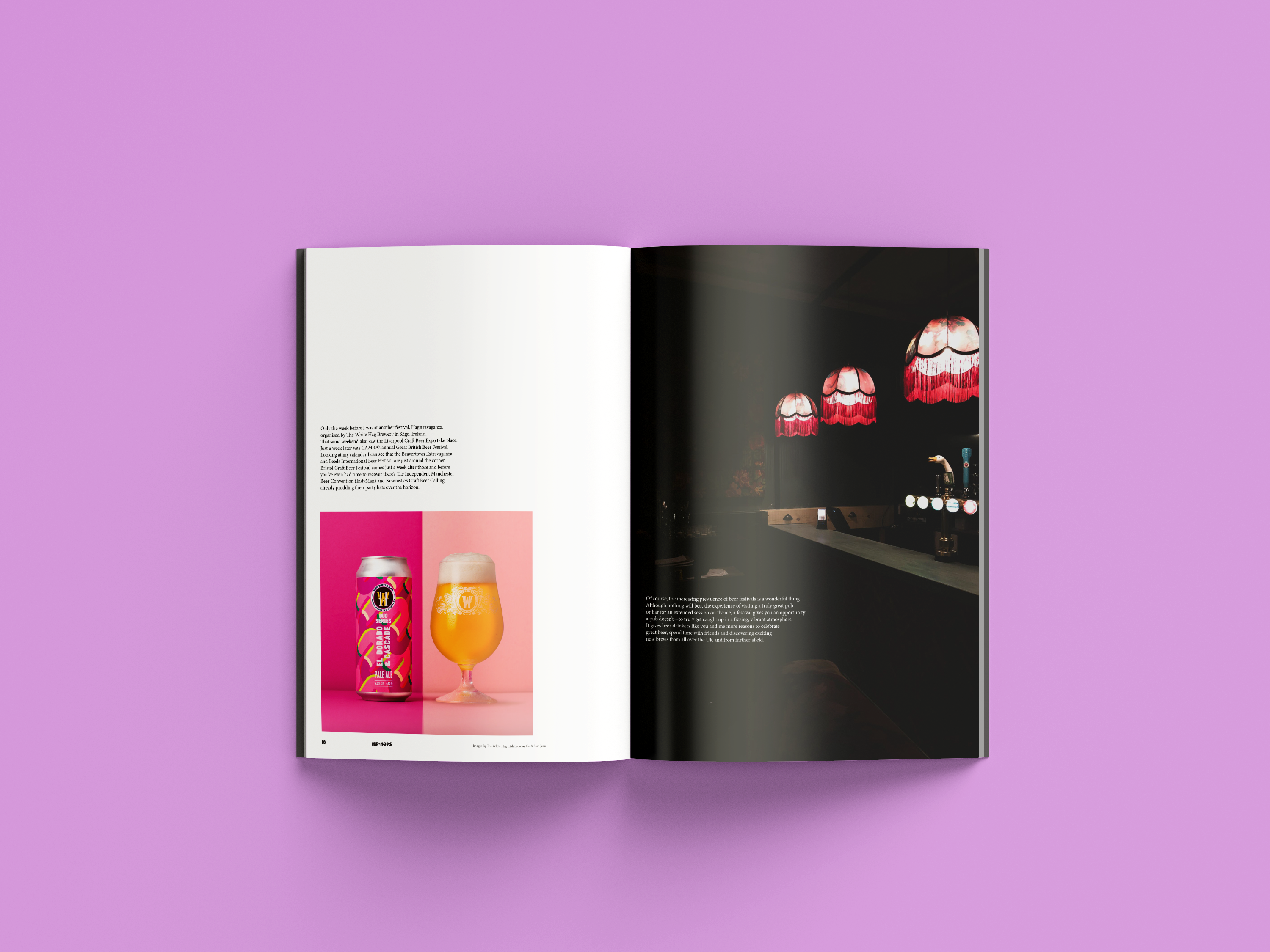
Crack open a beer and explore Hip-Hops
magazine, the go-to place to get your
monthly fix of beer news, brewing tips,
and exclusive interview with exciting
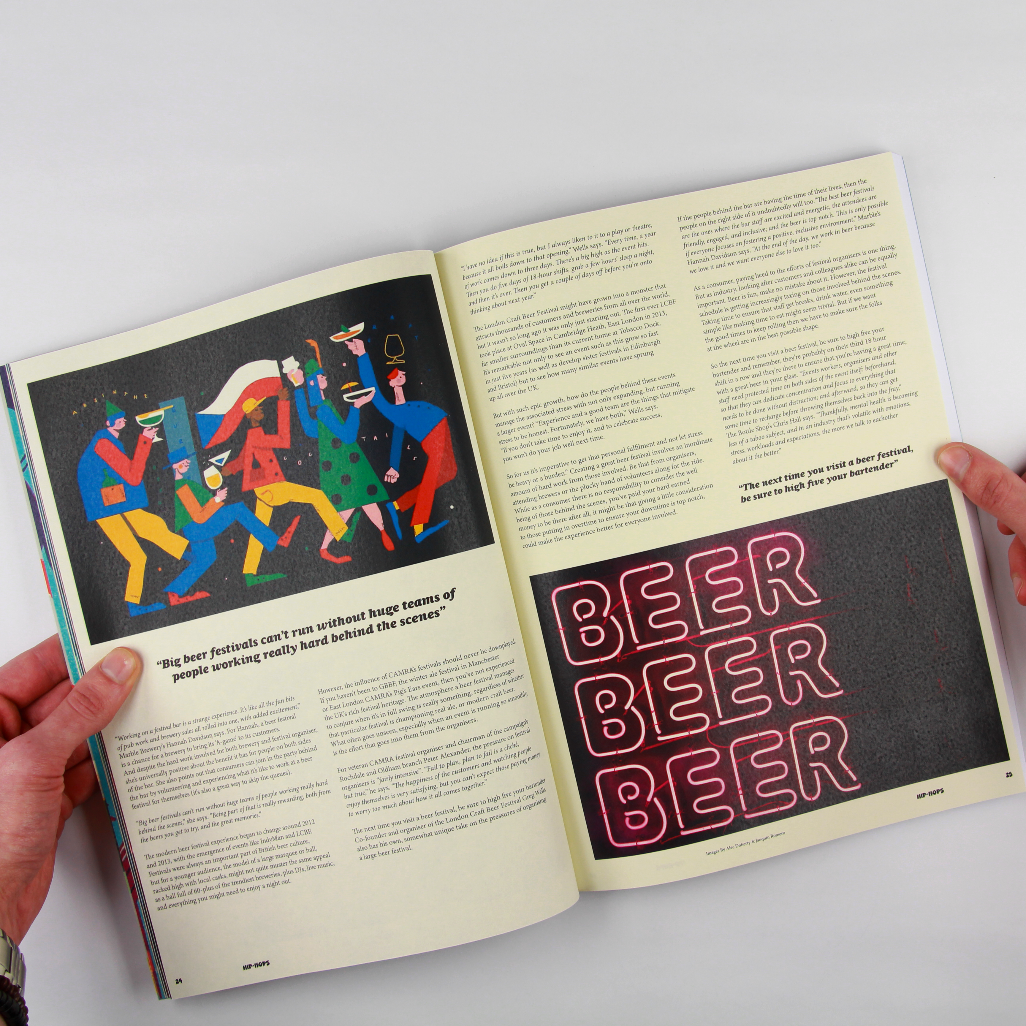
brewers from around the world. Featuring
incredible artwork, illustrations
and photography.
magazine, the go-to place to get your
monthly fix of beer news, brewing tips,
and exclusive interview with exciting
brewers from around the world. Featuring
incredible artwork, illustrations
and photography.
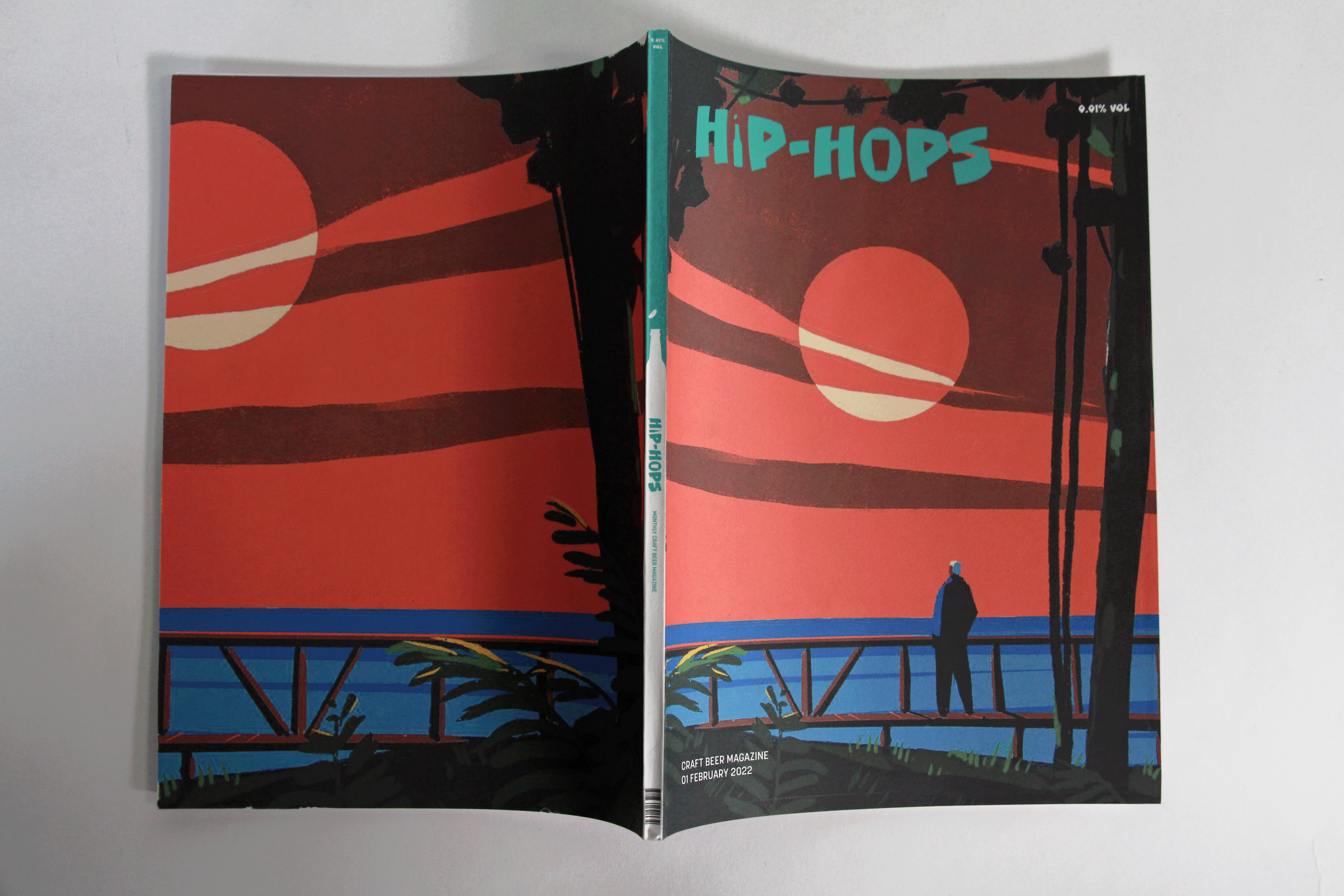


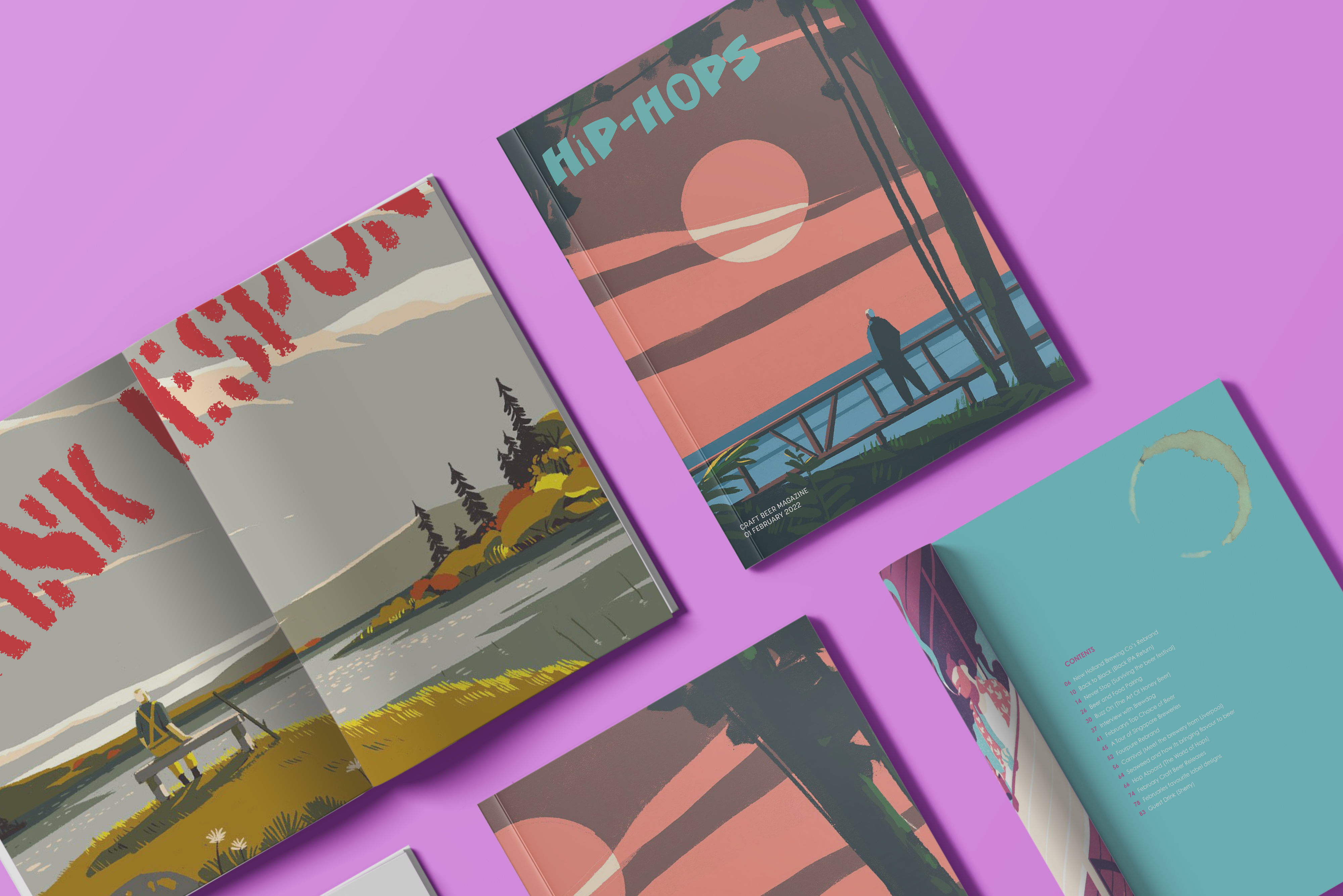
CCCloberintimesmooth typeface is ideal for
the masthead, providing a clear, relaxing
yet playful appearance appealing to the
target audience.
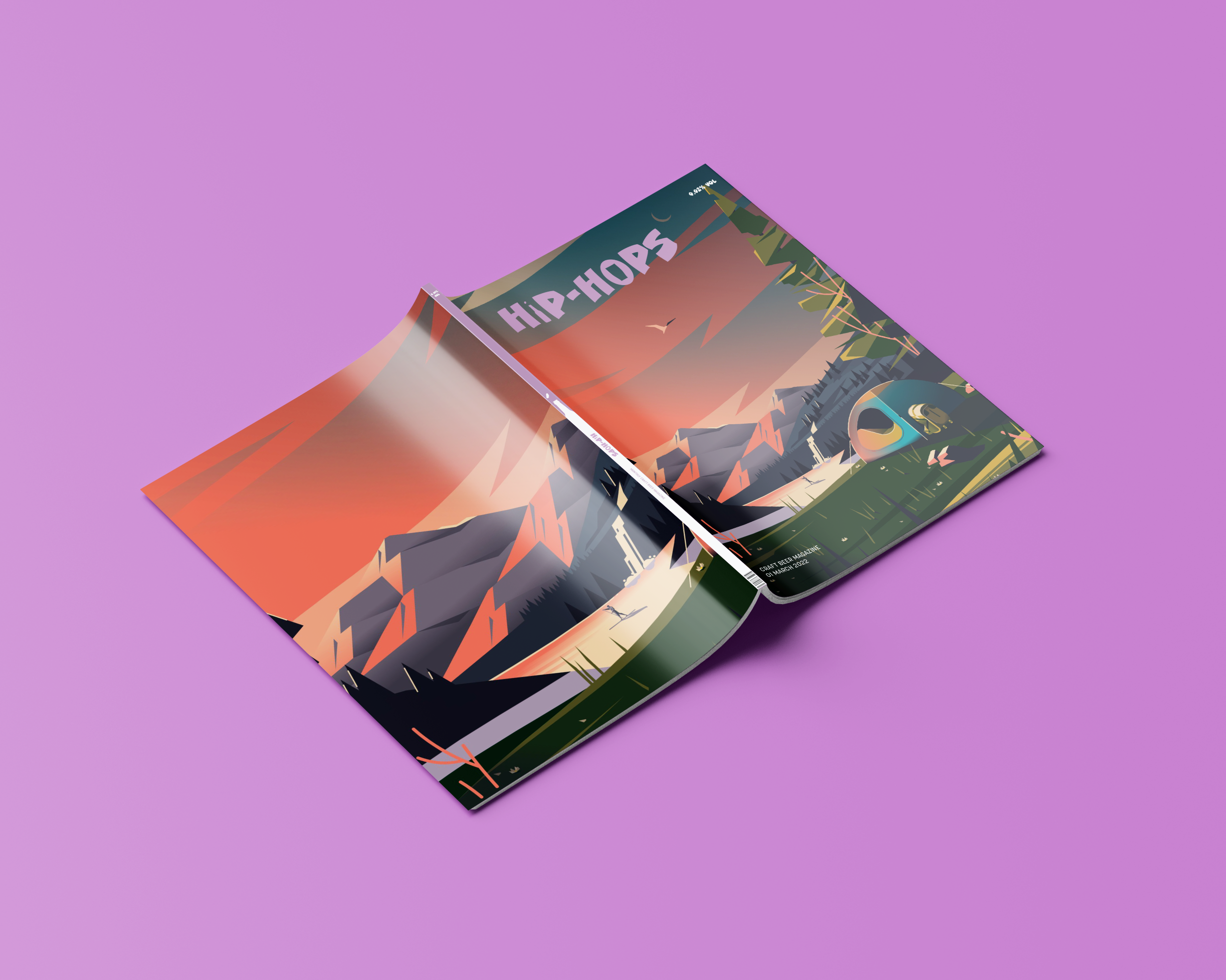
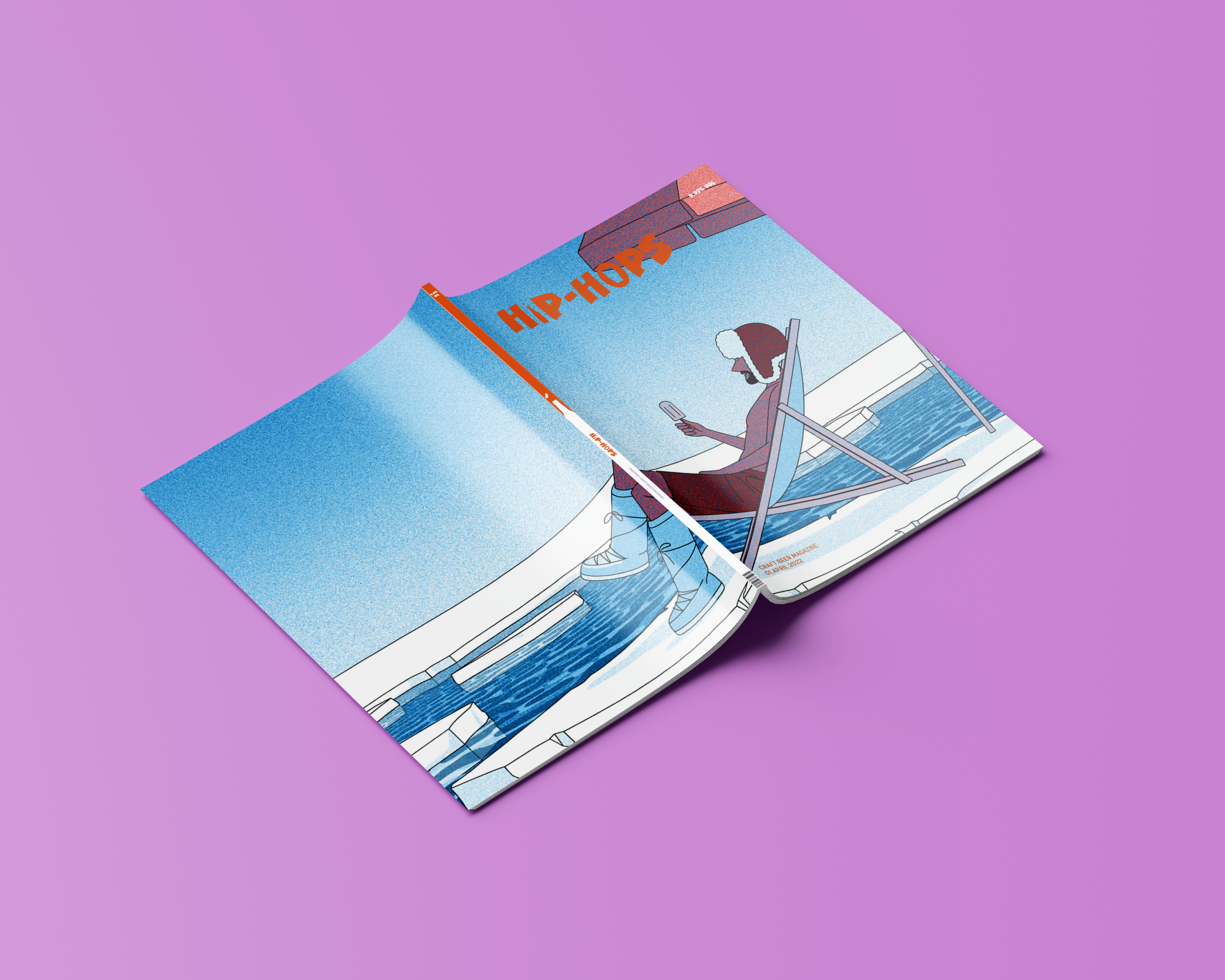
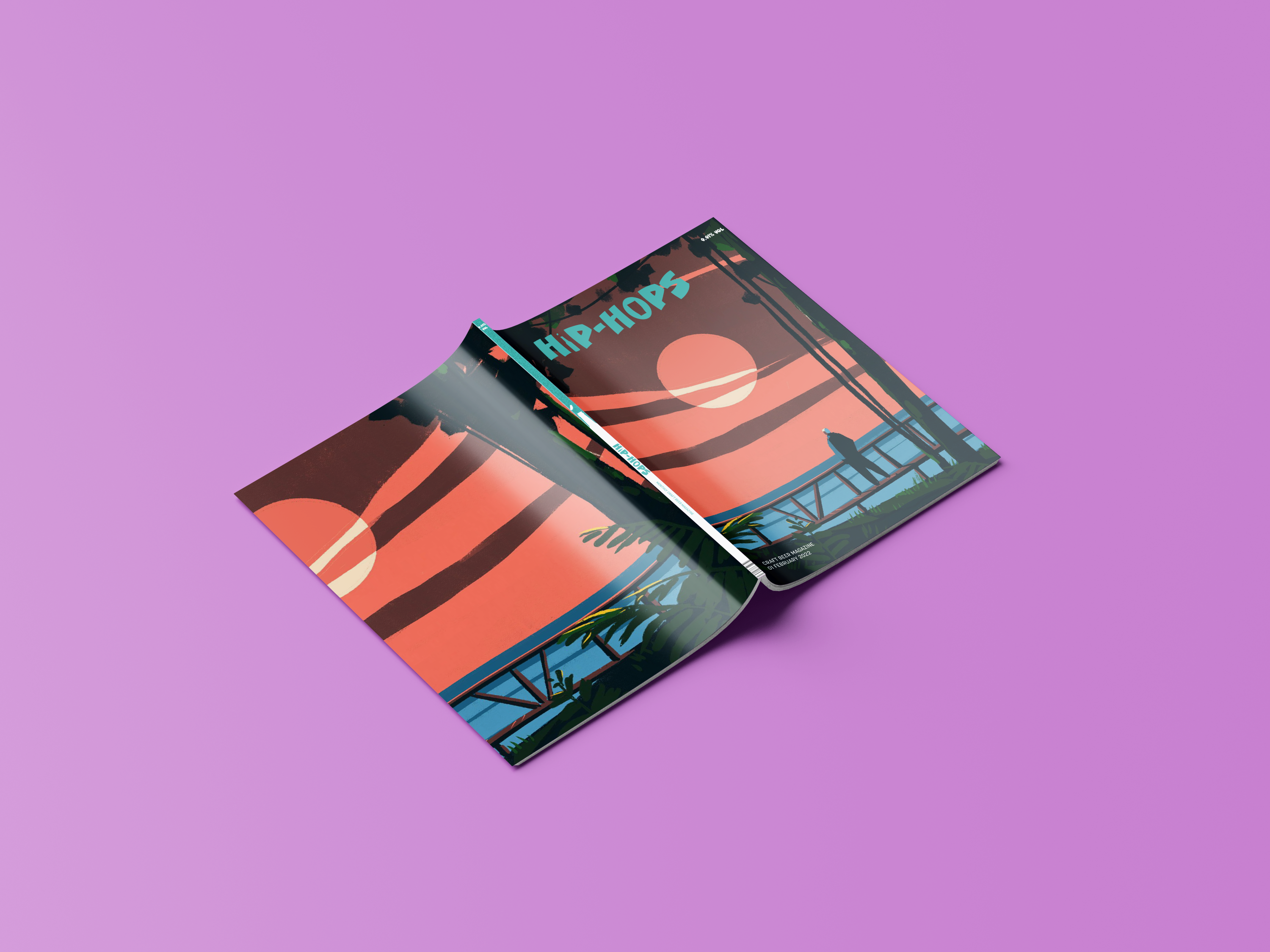
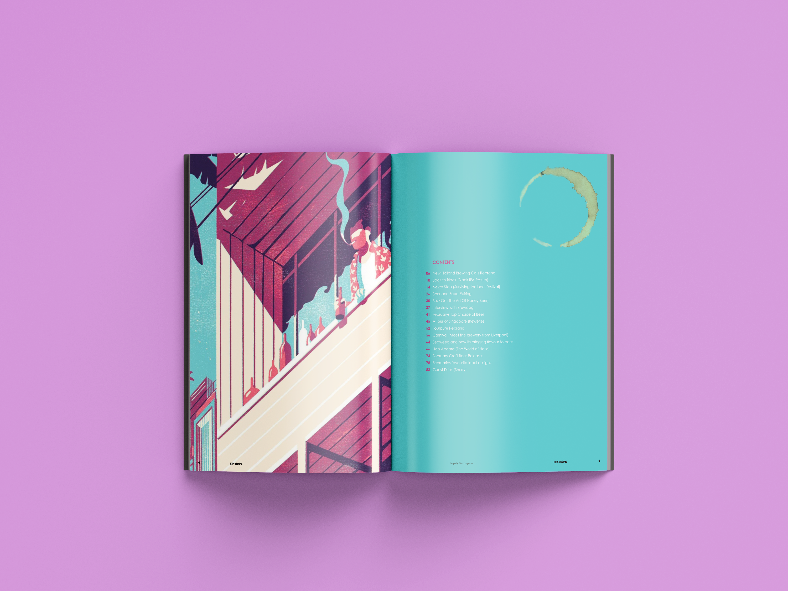
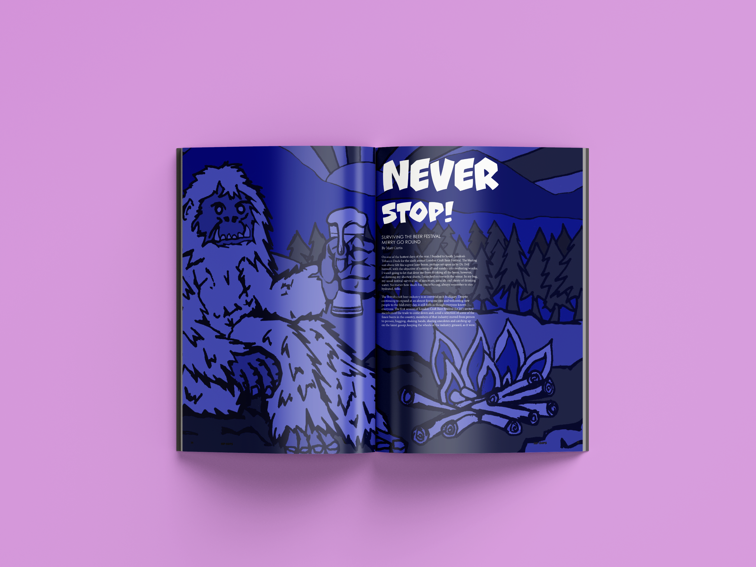
The covers feature exciting illustrations
from artists and illustrators around the
world, issue one featuring French illustrator
Frank-Tom Haugomat. Issue two features Romanian
illustrator Robert Filip. Issue three features
Belgian illustrator Jenna Arts.
from artists and illustrators around the
world, issue one featuring French illustrator
Frank-Tom Haugomat. Issue two features Romanian
illustrator Robert Filip. Issue three features
Belgian illustrator Jenna Arts.