OAT Collective
Brand Identity, Moving Image, Website Design.
This is the brand and visual identity for
the design collective ‘OAT’.
OAT are a none-profit design collective,
creating and delivering exhibitions based
on creativity and design for all creative
students and professionals.
the design collective ‘OAT’.
OAT are a none-profit design collective,
creating and delivering exhibitions based
on creativity and design for all creative
students and professionals.
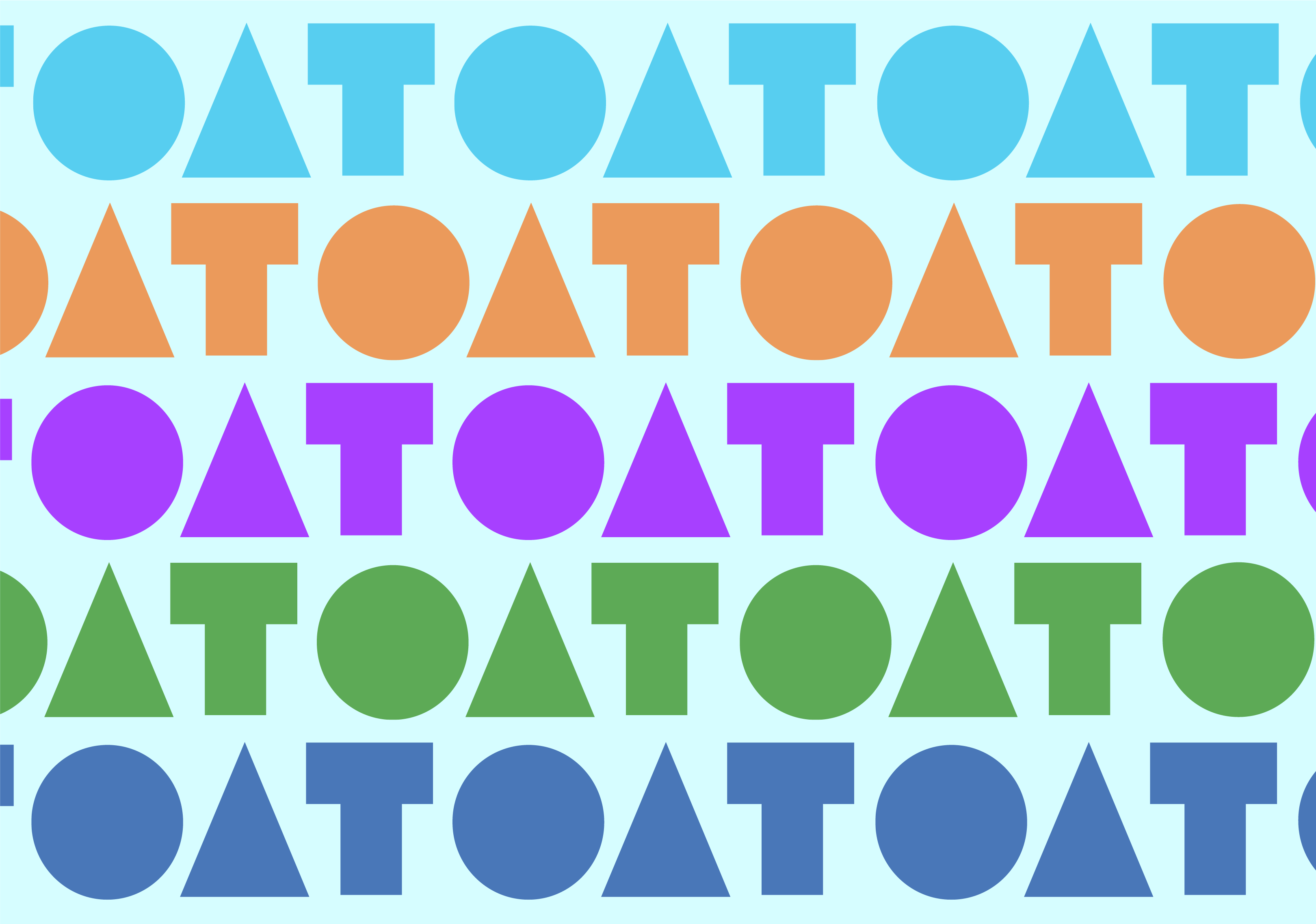
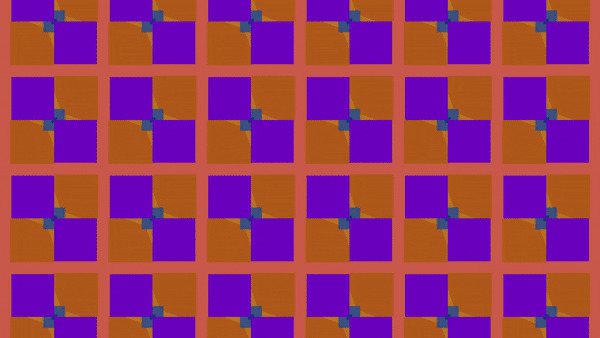
Four shape elements have been utilised for
the background of the logo. The coloured
shapes portray exhibition walls. The colours of these
shapes have been used throughout the identity.
the background of the logo. The coloured
shapes portray exhibition walls. The colours of these
shapes have been used throughout the identity.
I created a prototype for the brands
website, using the individual colours
from the logo as the site navigation.
website, using the individual colours
from the logo as the site navigation.
Elements from the logo have been
utilised to create patterns and
animations used across the identity
on deliverables such as the website,
trailers, merchandise and posters.
utilised to create patterns and
animations used across the identity
on deliverables such as the website,
trailers, merchandise and posters.