Timeless
Cocktail Bar
Brand Identity
A vestige of Hollywood’s golden age.
Located in the former 1930’s Liverpool
Forum cinema building. Timeless offers
guest’s classic cocktails, fine wine
and a fun time.
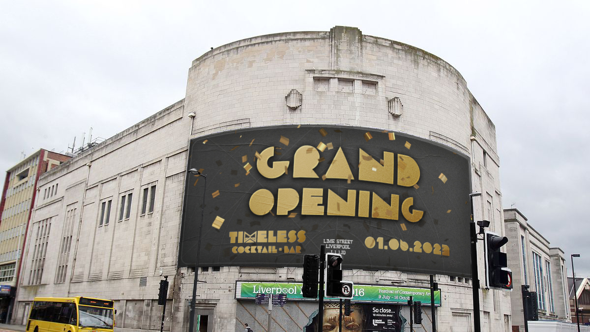
The concept begins with the abandoned cinema
on Lime Street, Liverpool. The ‘super’ cinema
first opened in 1931, showing all of Hollywood’s
major films, whilst also being used for Gala
performances and film premiers.
The the word ‘Timeless’ connotes
to how the building, its history
and its characteristics, are in-tact
and eternal.
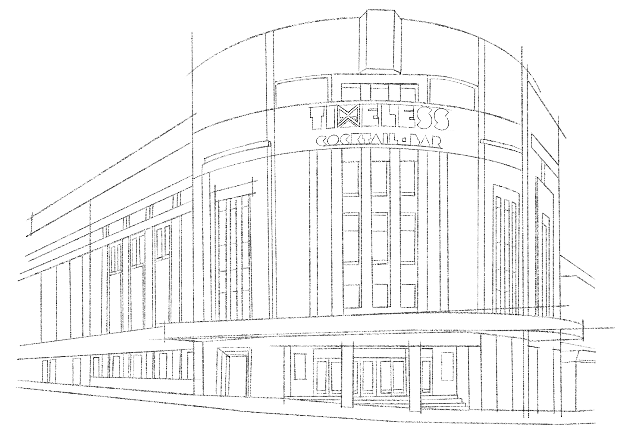
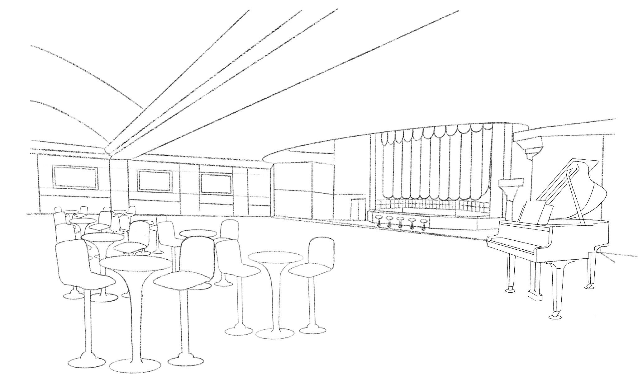
The architectural concept drawings
use the building’s existing structure
to display the bars layout.
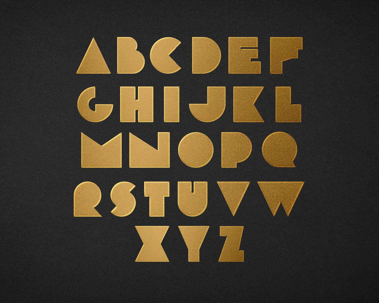
The primary typeface derives from
the typeface ‘Morro’. This geometric
typeface is reminiscent of end credits
in classic black and white films.
The glyphs have been modified to
give a solid, geometric appearance,
with a golden style, more suitable
for the brand’s luxury personality.
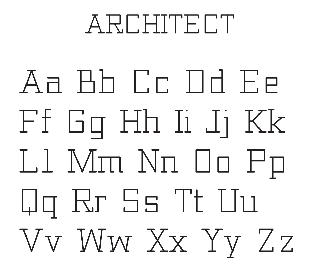
The secondary typeface is called ‘Architect’.
This typeface will be used for all body text
and sub text. The glyphs feature geometric
lines that resemble an architectural drawing.
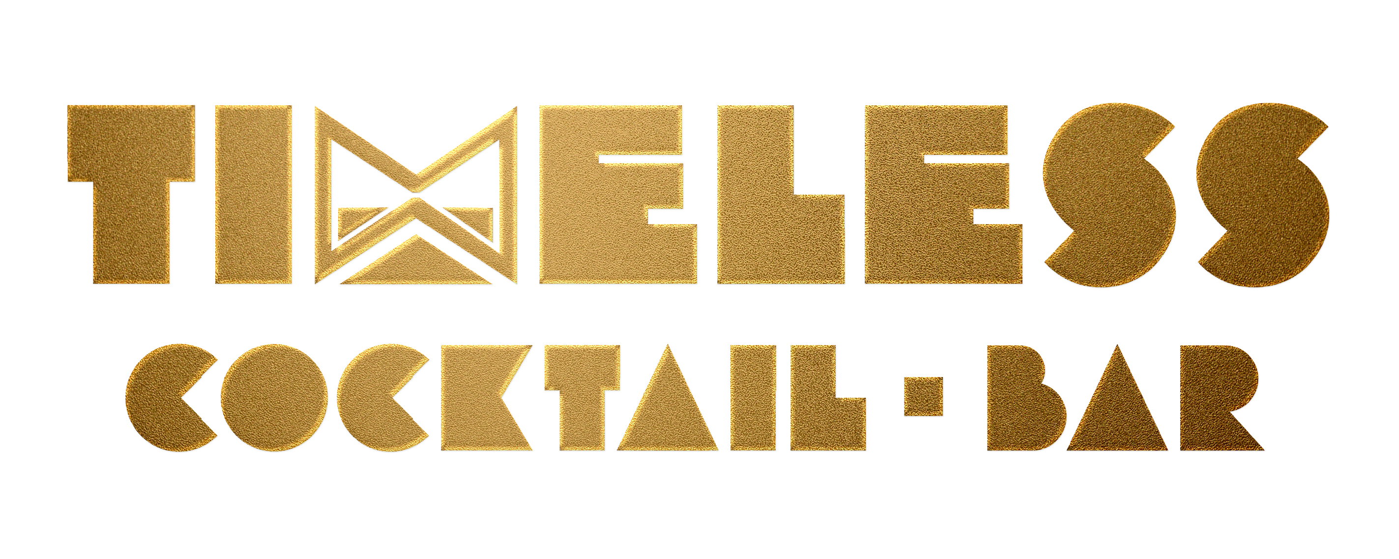
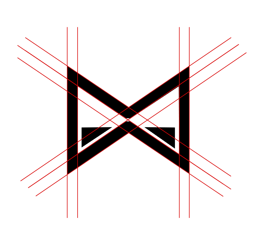
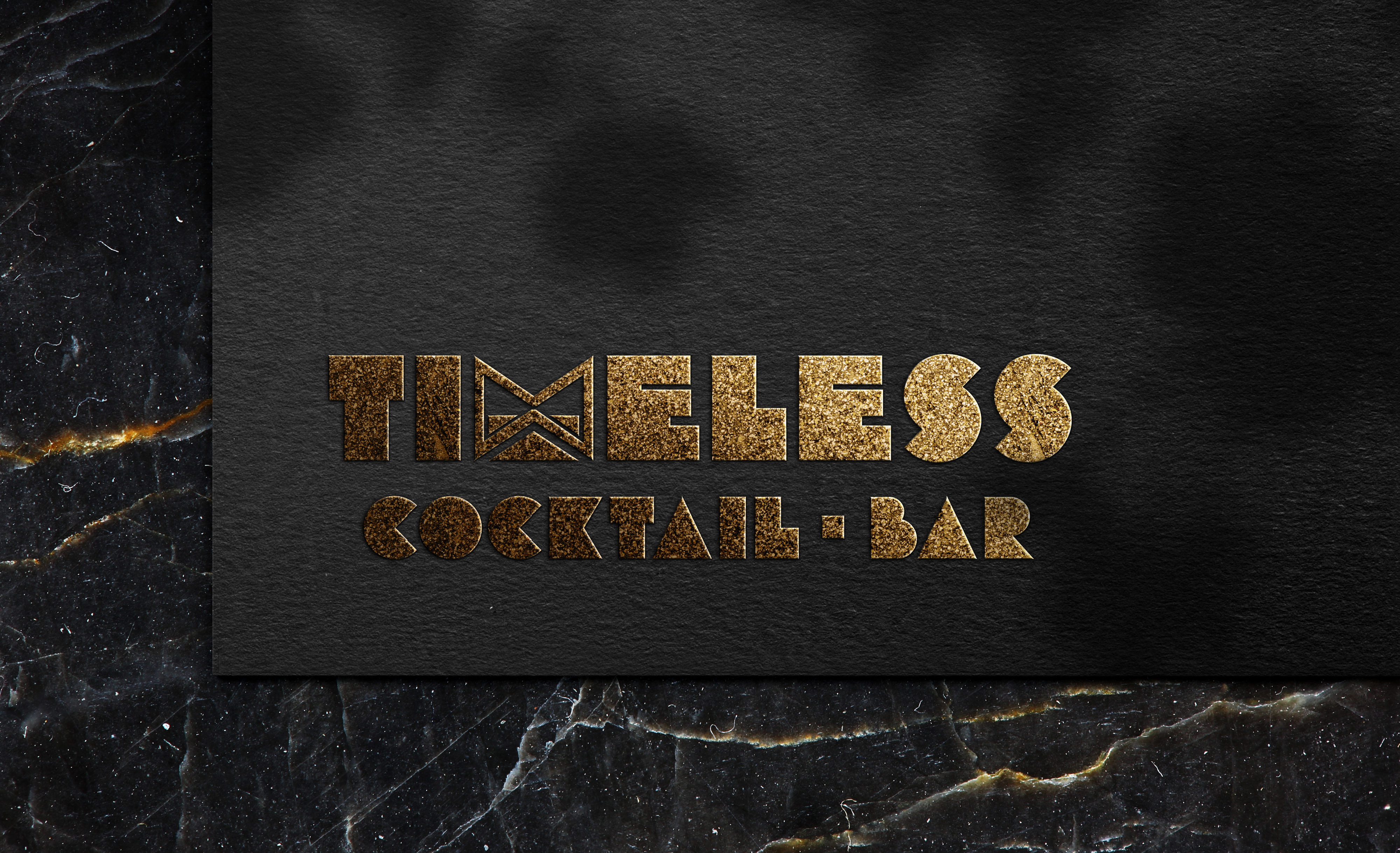
The ‘M’ in Timeless is the focal point,
which has been modified, using negative
space to give the appearance of an
hourglass on its side, signifying time
stopping, whilst also appearing as an
infinity sign to signify the building
being eternal.

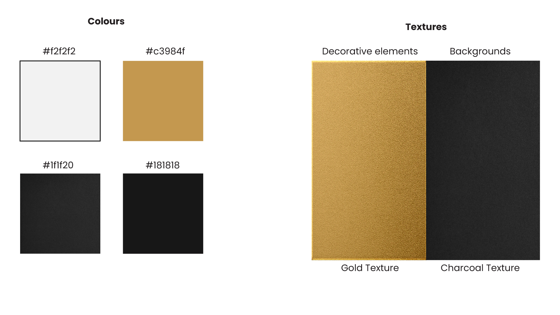
Gold embossing can be used on the print
assets to give a luxury look and feel.

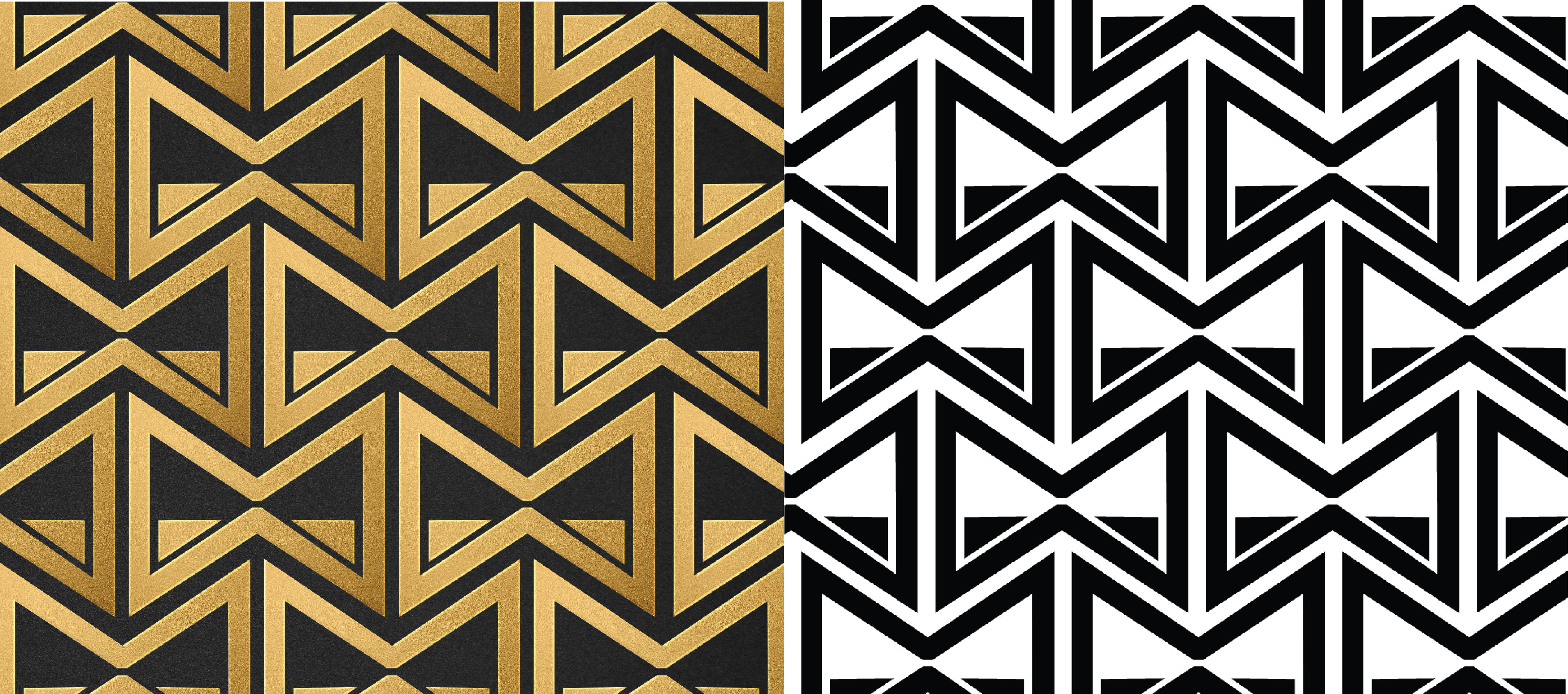
The logomark’s symmetrical geometry makes
it possible to be repeated and fit into
itself precisely. This pattern component
will be used mainly for decorative elements.

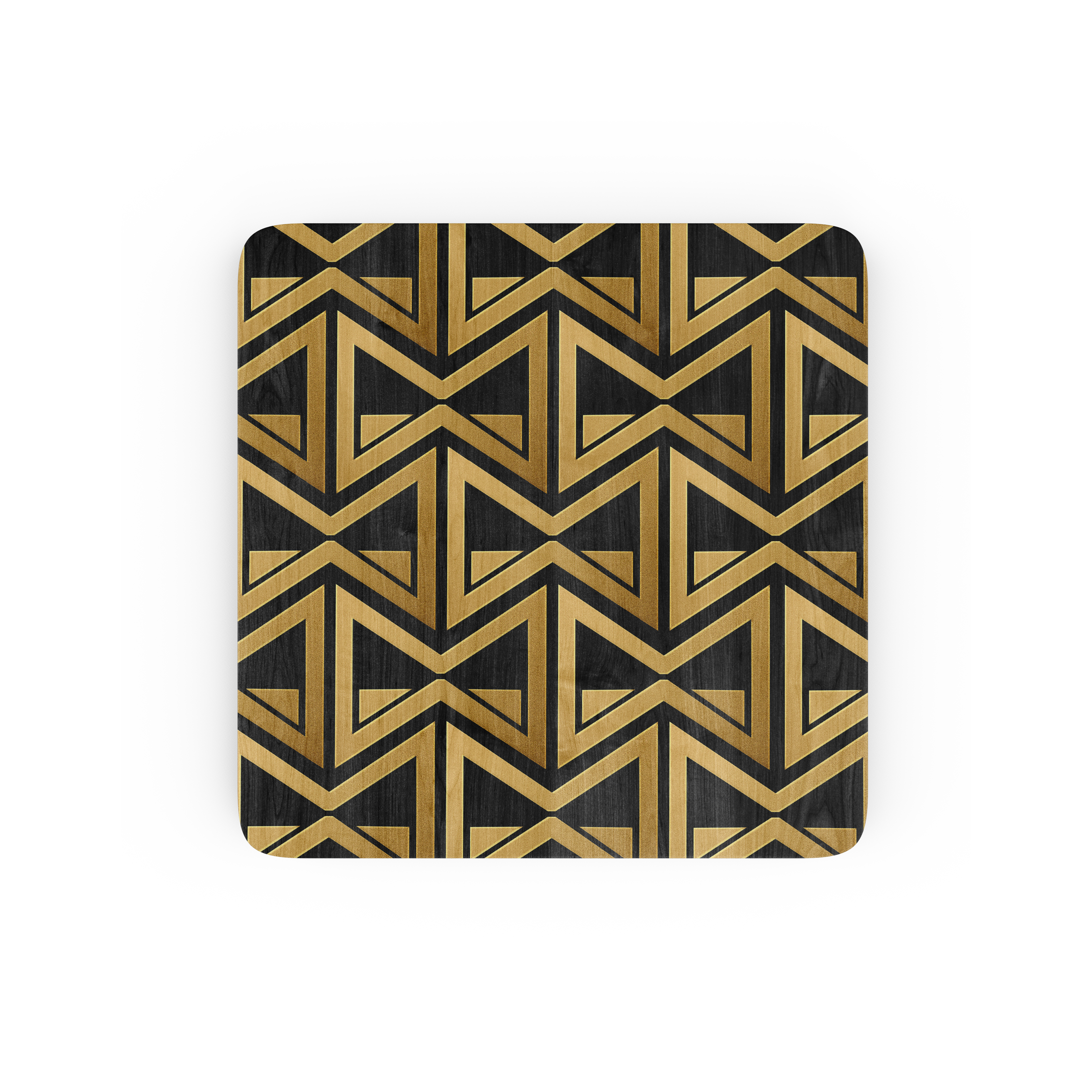


The main pattern component is geometric
linework, containing abstract shapes
with an asymmetrical repetition.
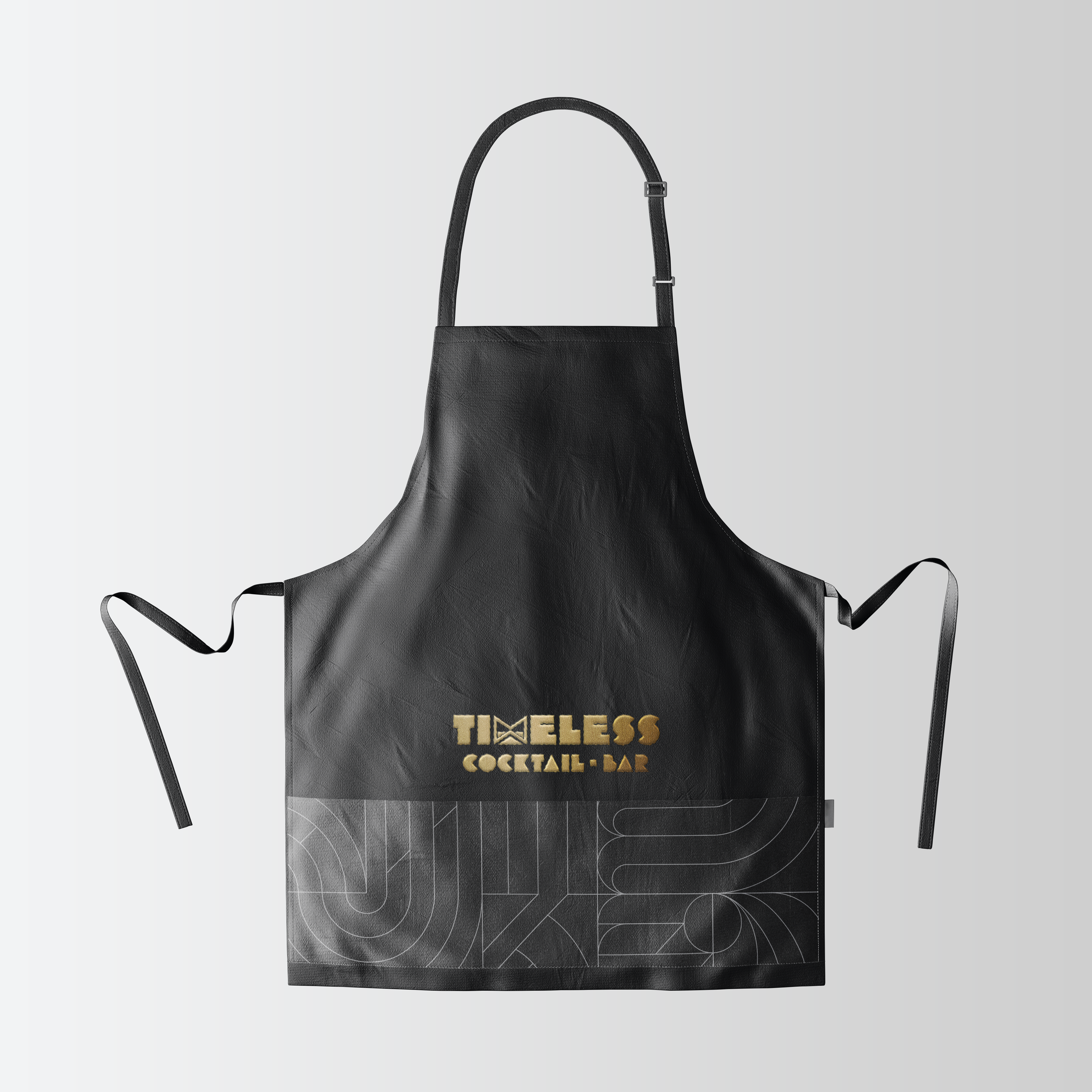
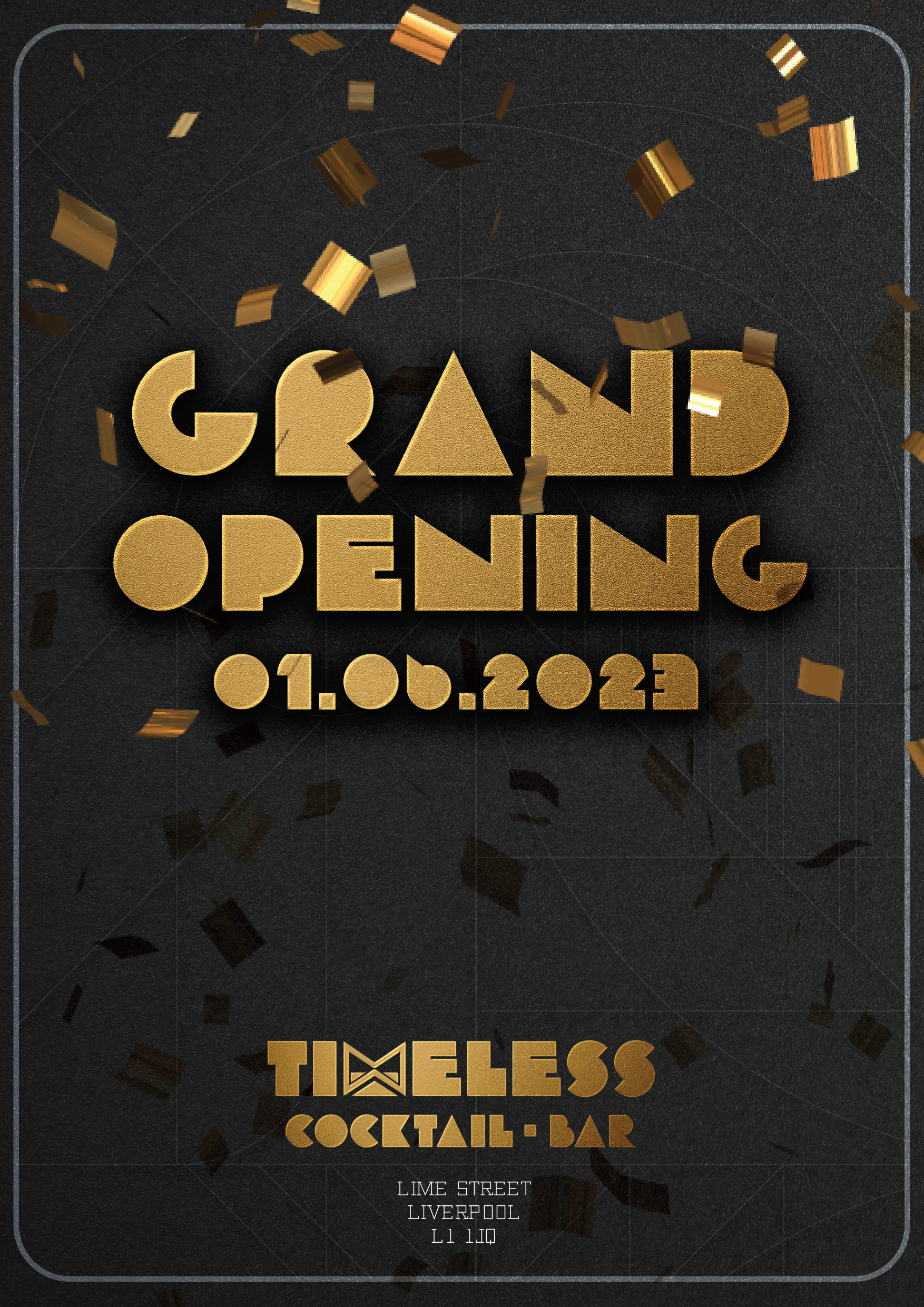
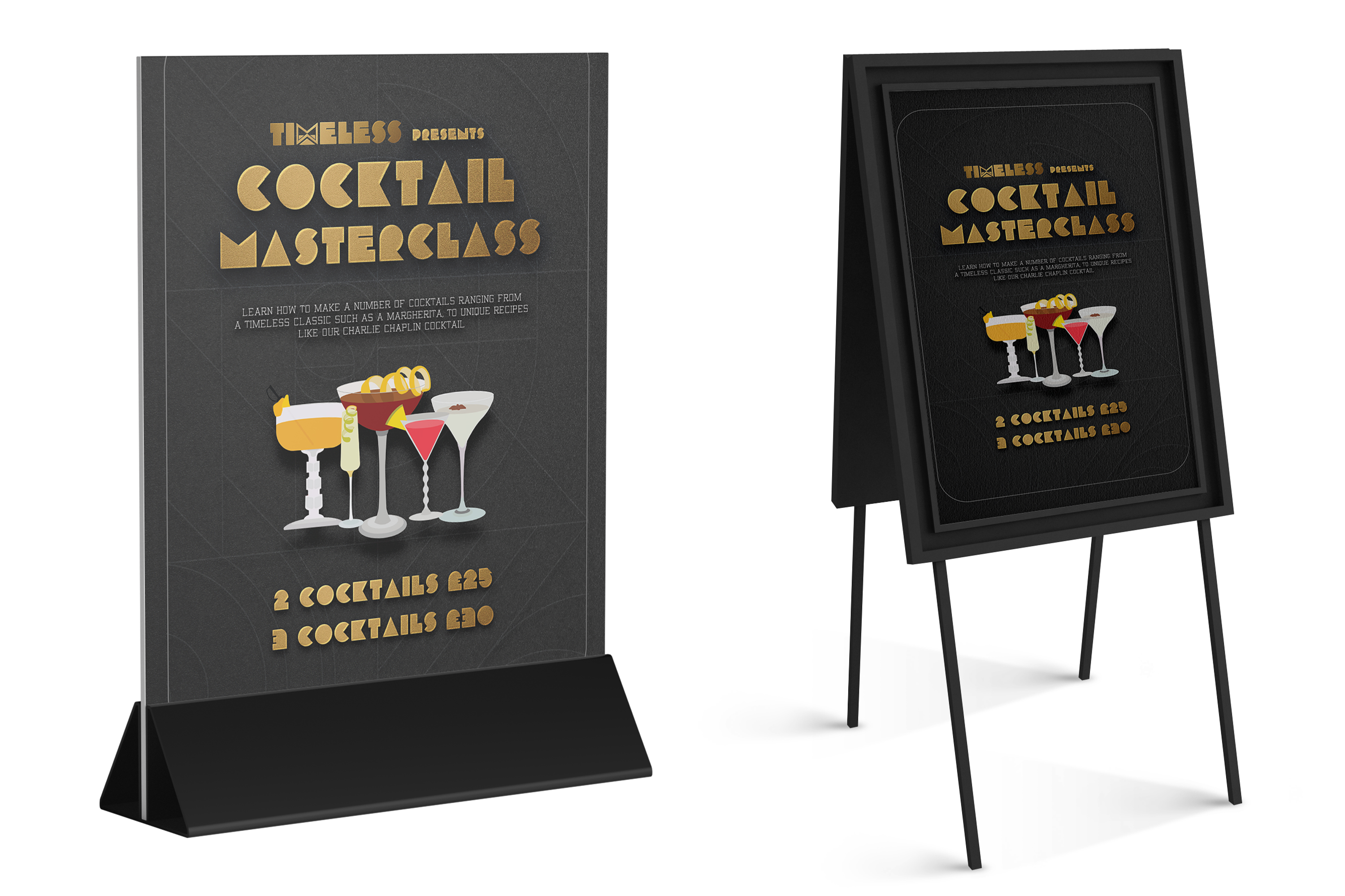
The pattern design will be used across majority
of the brand assets, including the posters.





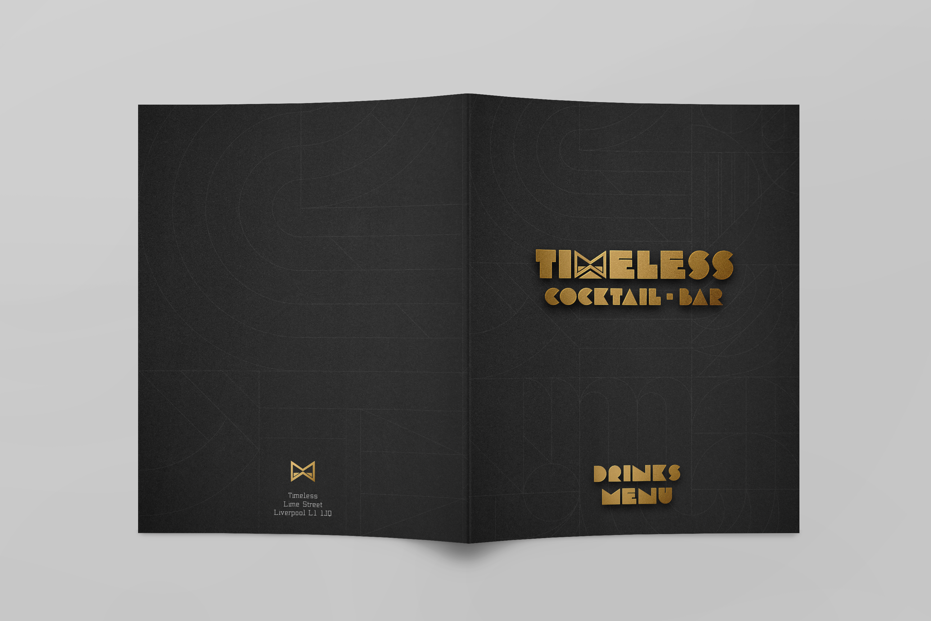
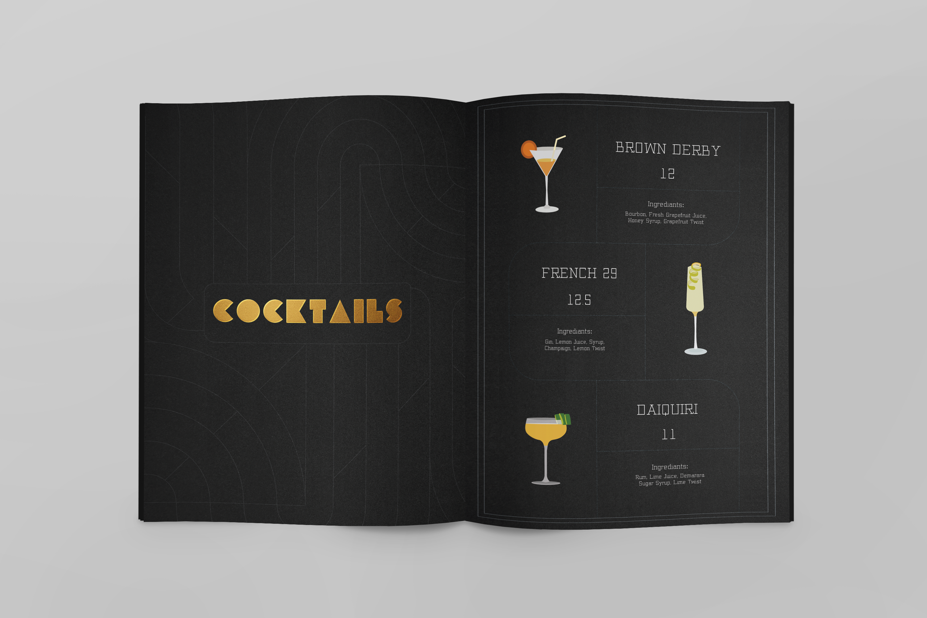
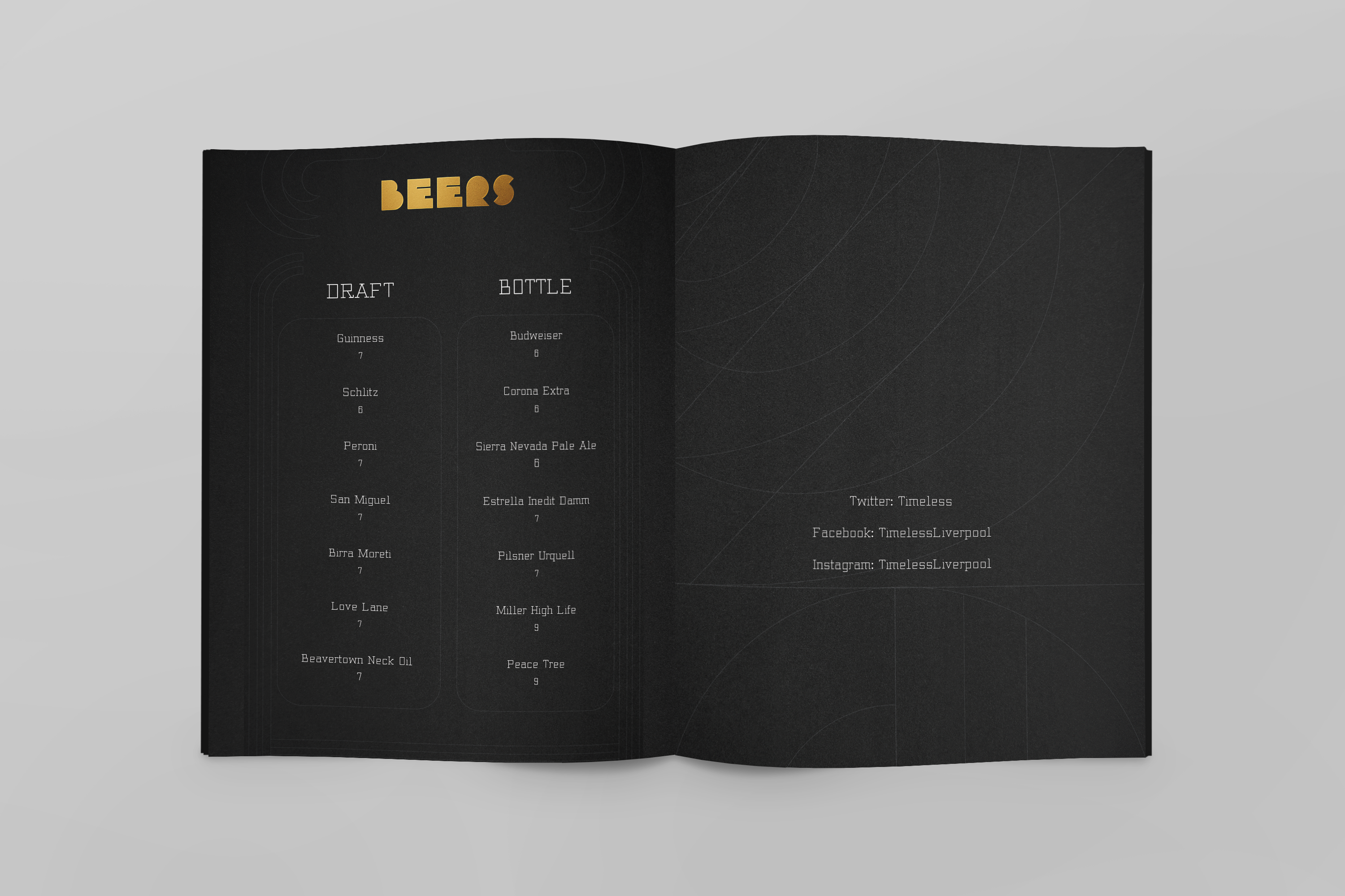
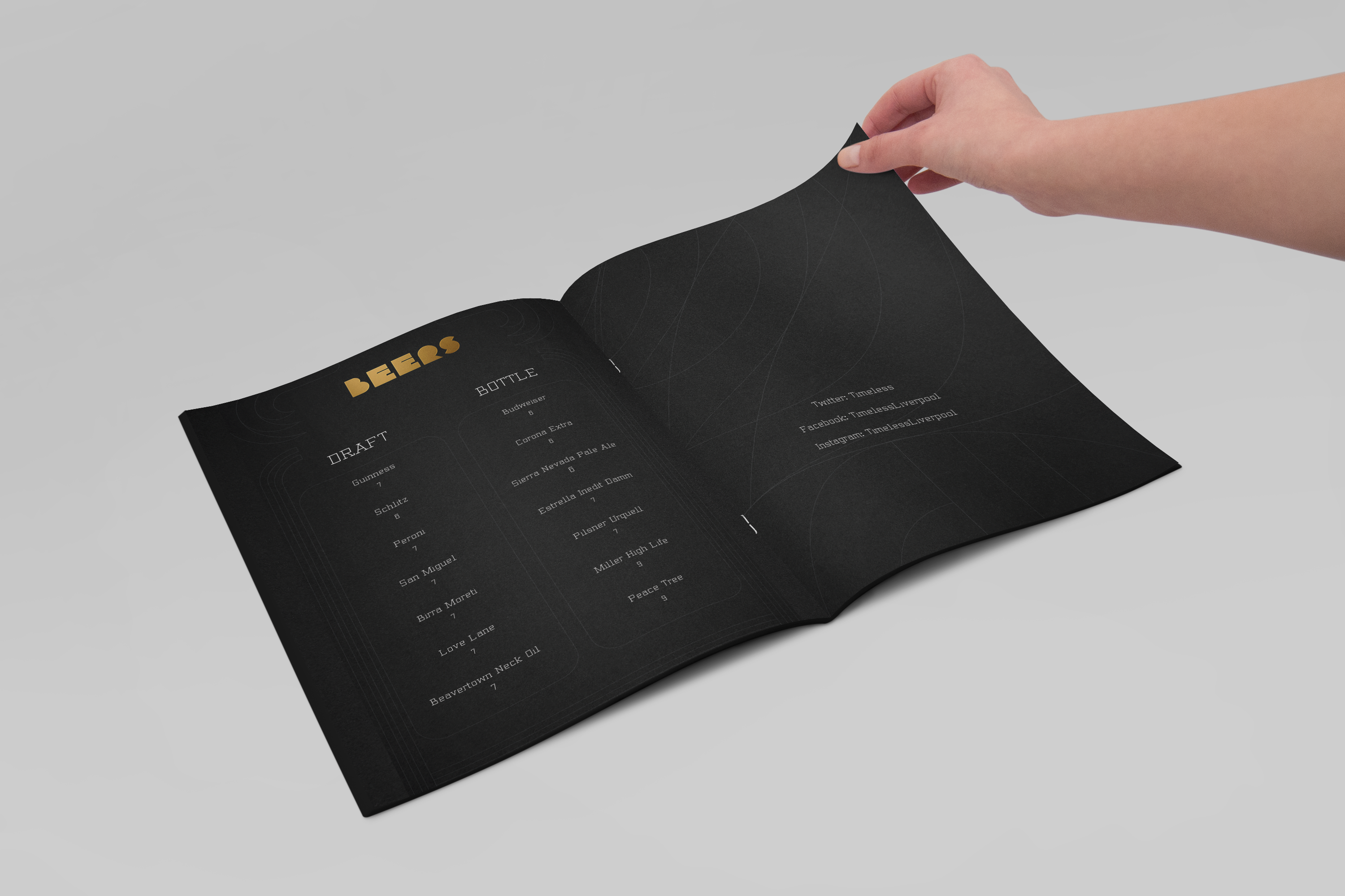
The menu will use a heavy 400-540gsm
charcoal stock, with gold foil embossed
elements, to give a premium, luxurious
look and feel.




The idea behind the website is to
show off the visual identity, concept,
characteristics and personality whilst
being a simple, easy to navigate experience.


touchpoints the bar has with its customer
base and the public.
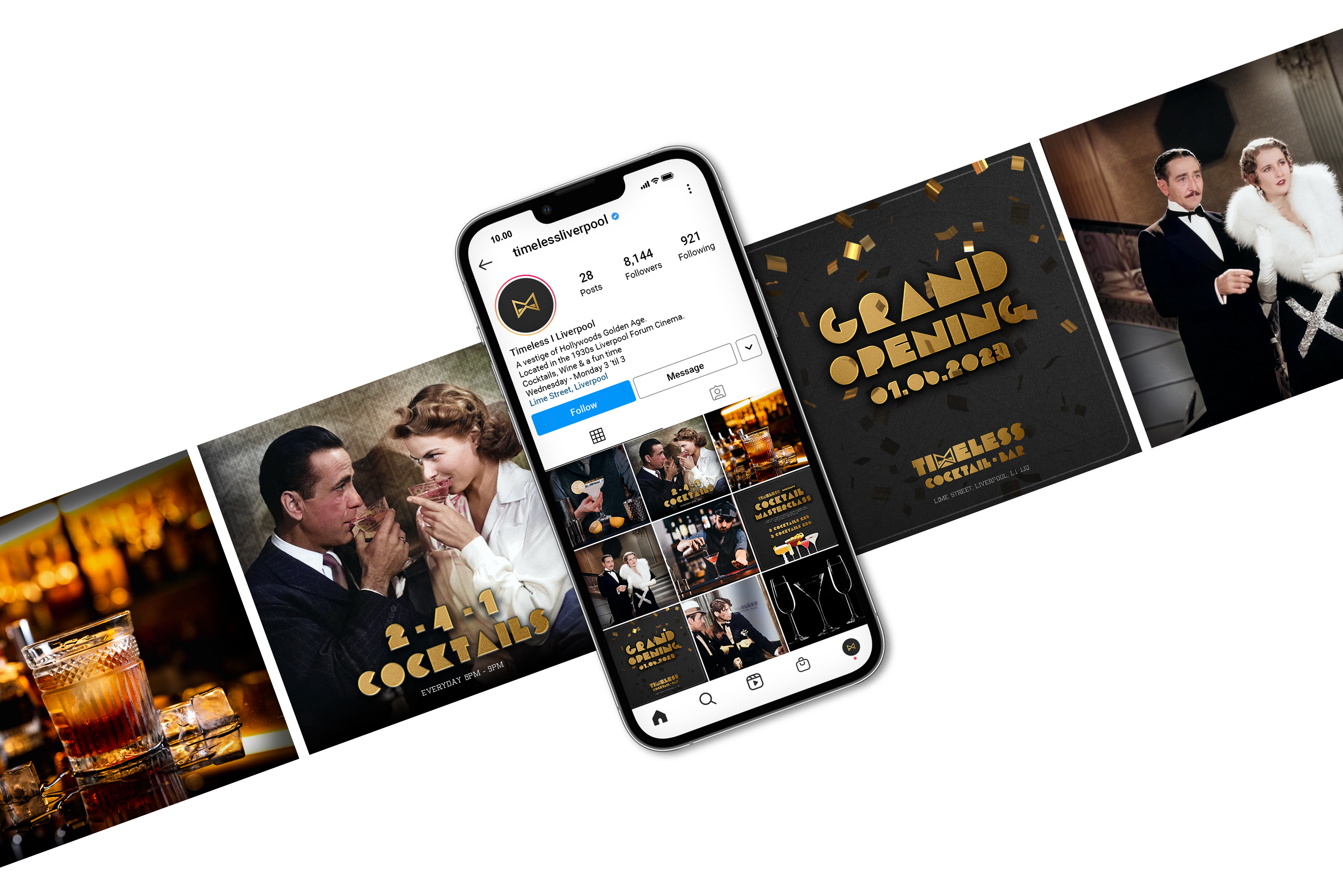

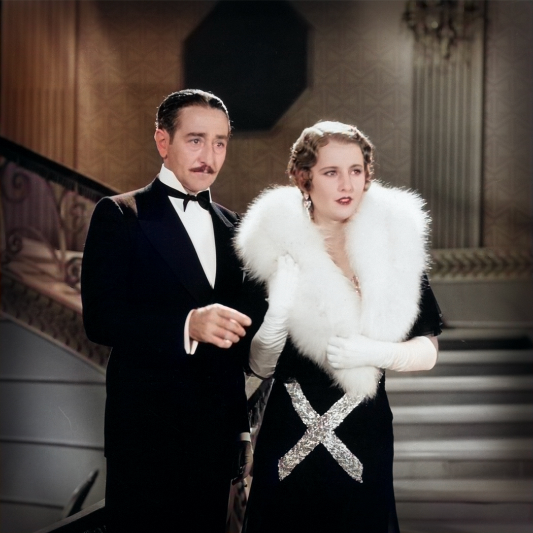
The artwork for the brand uses black
and white scenes from films released
around the 1930’s. The Timeless
wallpaper has been subtly placed into
the image as a tasteful easter egg.
The images will remain black and white
for the interior wall art and colourised
for social media posts.




︎︎︎ Home


